We don’t take ourselves too seriously here in The Cave, at least we try not to. It does happen, occasionally… like when we’re analyzing ambiguous life lessons buried deep within what you thought were lighthearted 80’s movies. Mostly, we’re just having fun talking about what we like.
Sometimes, though, stuff gets real.
While I adore the other half of my MMIS, what he said in Episode 14… that needs to be addressed and rectified.
STAR TREK POSTERS ARE NOT RIP OFFS OF STAR WARS POSTERS, YOU WEIRDO.
Let’s begin by examining the original poster used for Star Wars in 1977, conceptualized by an artist named Tom Jung (left), and later, at the request of George Lucas, “re-imagined” by artist brothers Tim & Greg Hildebrandt (right):
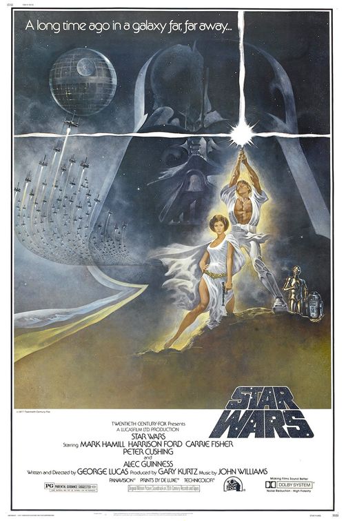
This poster is exciting, it makes me want to see this movie. I really get the feeling of a space opera here. It comes complete with a tagline and features all the major players…except, who are those two humanoids in white?
You know who they aren’t? Carrie Fisher & Mark Hamil. Actually, Tom Jung said in an interview that his wife posed for the concept (left), and he “changed the hairdo and shoved the paint around until [he] came up with the figure you see” in the original concept. Later, when the Hildebrandt Brothers painted their own rendition (right), they did not use photo references of Fisher or Hamil – so the figures featured on the poster of the movie in which they star do not actually look anything like them. As a book cover, this would have been amazing! Except, the glowing beacon that Luke is valiantly thrusting into the sky doesn’t look anything like a lightsaber. What is that, Excalibur?
Fast forward a little bit to 1979, when Star Trek: The Motion Picture was released. Here we examine the original poster created by illustrator Robert (Bob) Peak:
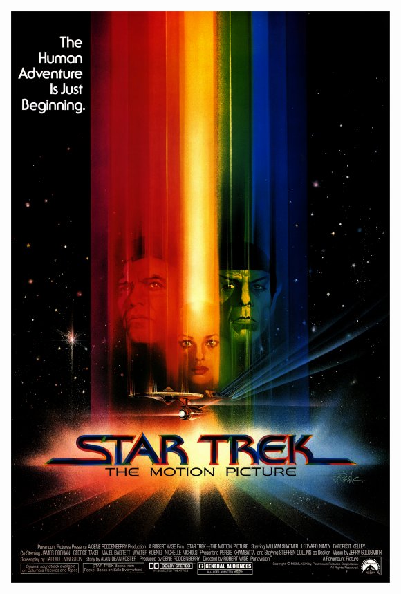
Visually stunning.
Notice those sparkling stars and light bursts, that’s something you’ll want to remember for later.
The Empire Strikes Back was released in theaters the following year, 1980. An artist named Roger Kastel painted the theatrical poster for this film (and Jaws). In the book “Star Wars Art: Posters”, he writes that George Lucas wanted the project centered on Leia and Han, embracing in a way that recalled Rhett Butler and Scarlett O’Hara in the poster for “Gone With the Wind.”
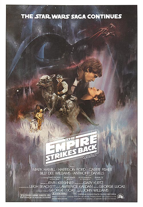
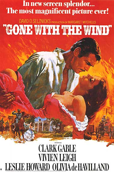
Nailed it.
But for emphasis: This poster was inspired by Gone With The Wind. Star Wars, you might say, copied the movie poster for Gone With The Wind.
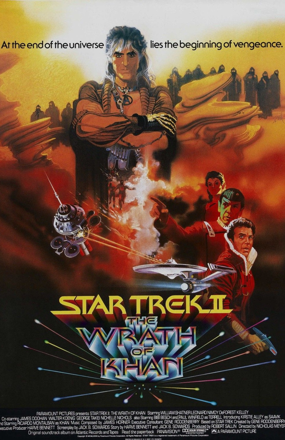
Star Trek II: The Wrath of Khan
was released in theaters in 1982.
This poster is pretty boss.
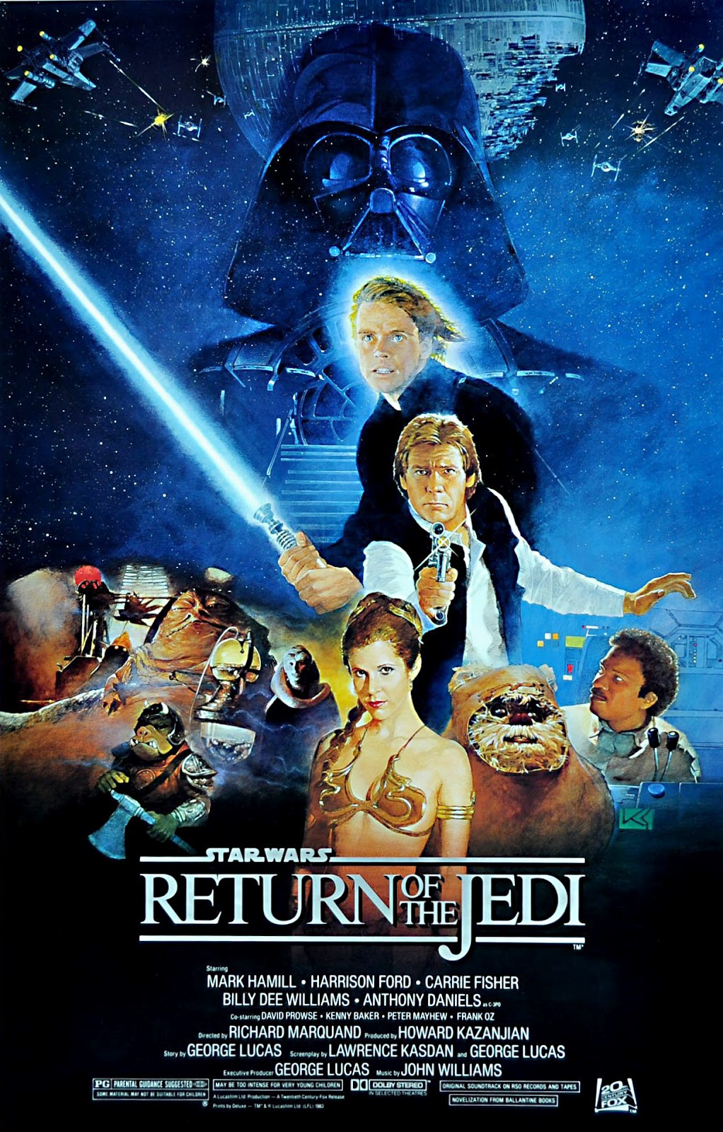
Return of The Jedi was released in 1983.
This poster was done by Japanese artist Kazuhiko Sano.
(Fun Fact: He’s also the artist responsible for the cover art of Star Trek books published between 1993 and 1999 like World Without End, The New Voyages, and Spock Must Die!)
Check that out, Darth Vader looms over a cascading collage of protagonists in an ominous way. Nice. I like it.
It feels…familiar…
Boom.
Yeah, that happened.
There’s Khan, ominously looming over Kirk, Spock & Saavik.
Fascinating.
After the release of Return of The Jedi in 1983 (a year after Wrath of Khan was released, in case you missed that before), theatrical release posters dropped off for the Star Wars franchise. (Caravan of Courage: An Ewok Adventure was made for TV in 1984, as was the sequel Battle for Endor in 1985, so they don’t count.) Star Wars would not release another theatrical poster for over a decade.
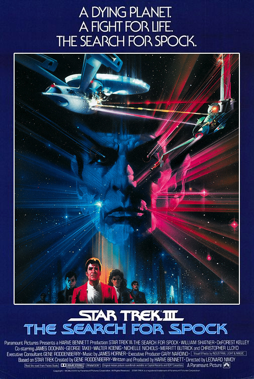
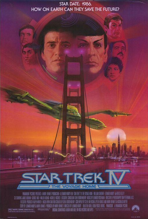
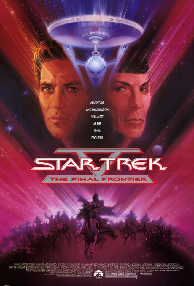
Meanwhile, Star Trek released a few more movies – III (1984), IV (1986), V (1989) with posters created by Bob Peak. (Fun Fact: Bob Peak, is known as “The Father of The Modern Hollywood Poster”.)
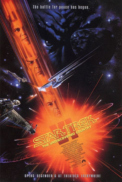 The movie poster for Star Trek VI: The Undiscovered Country, released in 1991, was done by a different artist, John Alvin. He obviously brings his own fresh style to the design, but also retains a few key elements from Peak’s designs. Such as the faces of Kirk, Spock and McCoy in the beam of light, reminiscent of the poster for Star Trek: The Motion Picture.
John Alvin is responsible for some of the posters we discussed in Episode 14, such as Jurassic Park, E.T., and The Lion King – as well as The Princess Bride, Alien, Blade Runner, Disney’s Beauty and The Beast, Aladdin, Batman Returns, Batman Forever, Cocoon, Gremlins, and Arachnophobia, to name a few.
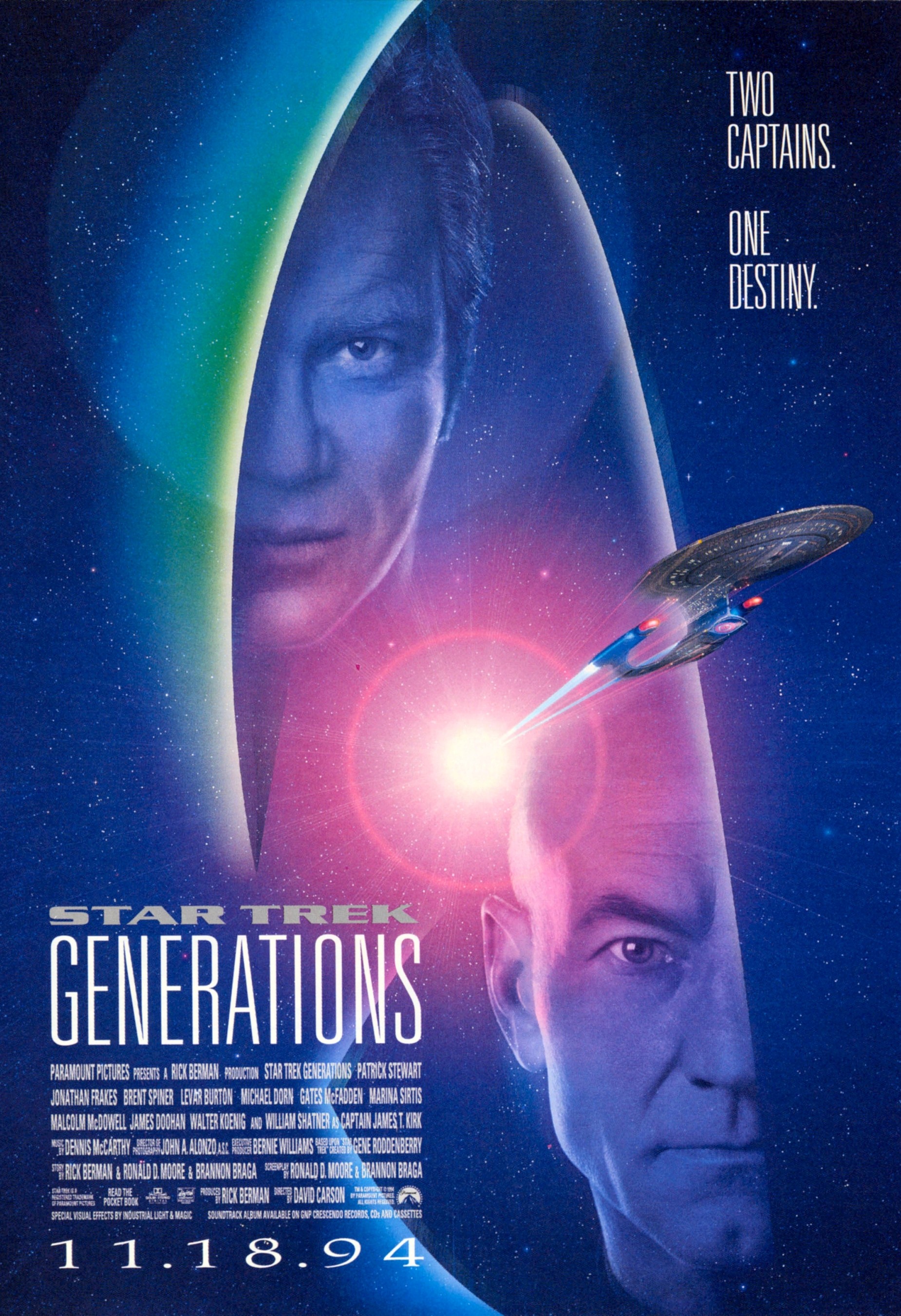
The poster I described in Episode 14 as one of my most memorable is that for Star Trek: Generations (VII, 1994). This was done by an artist who remains anonymous. This artist still captures the elements of Peak’s designs, primarily the floating faces of the main characters. It is the first time we see lens flares, and the iconic image of the Starfleet insignia on a Trek movie poster.
Two Captains. One Destiny.
*swoon*
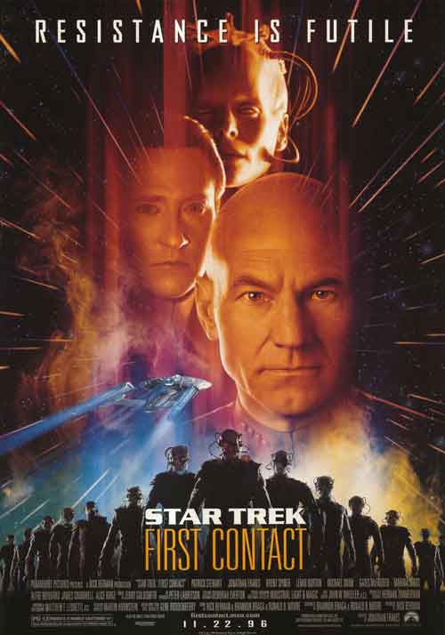
Star Trek: First Contact (VIII) was released in 1996.
This poster draws elements from all previous designs, such as the main characters’ faces superimposed in the beam of light, the Enterprise depicted in movement, and some similar structural design elements from the posters for The Search for Spock and The Final Frontier.
In 1997, the 30th Anniversary Edition of Star Wars, now titled A New Hope, was released with a new poster. The artist commissioned for this was Drew Struzan. He redesigned the posters for Empire Strikes Back and Return of The Jedi, and is also the artist responsible for the original posters for Star Wars Episodes I – III.
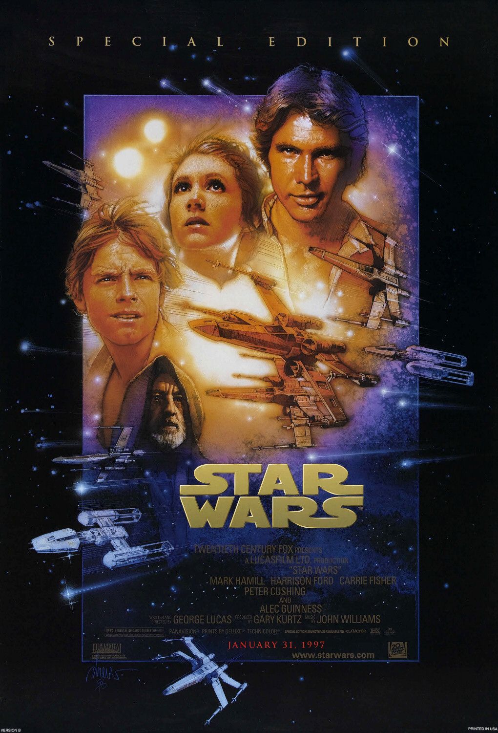
This special addition poster is iconic, yes.
But, after my extensive research expedition into the history of modern movie poster art, it appears to be a re-imagined, customized mash-up of 8 previously released Star Trek movie posters. The basic elements are the same. Like, the way the shooting stars and light bursts emanate from behind the faces of Luke, Leia and Han in the same kind of style that the light beams emanate from the faces of Kirk and Spock in the poster for Star Trek V, or the way the “warp speed” stars are depicted in the poster for First Contact. Not to mention the back-lit ships. And, we’ve already discussed at length the clear origins of the cascading faces.
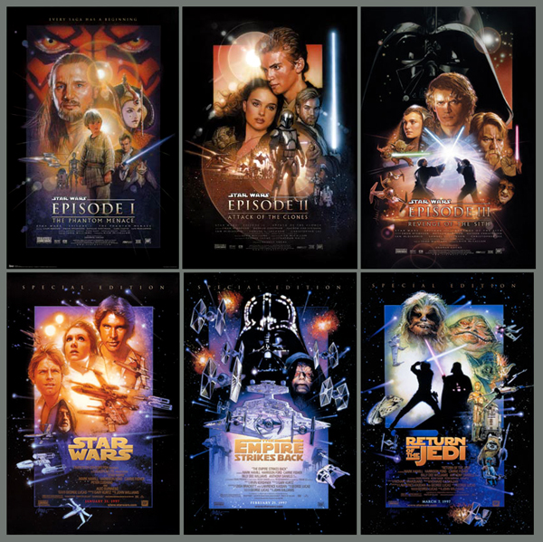
In fact, all 6 Star Wars movie posters are each influenced by preexisting Trek posters in one way or another.
Of course, there’s nothing wrong with that. Artists draw inspiration from one another all the time. But, let me be clear: Not only are Star Trek posters not even close to looking like copies of Star Wars, visual evidence and release date chronology suggest it is, in fact, the other way around.
You’re welcome, everyone.
Little Sparrow Out.
P.S. About my pick of the week… The EPIC episode of Star Trek: The Original Series entitled “City on the Edge of Forever”, that you should most definitely watch right now, is not part of season two. Nope. I mislead you. It is actually episode # 28 – the season finale – of season one.
P.P.S. About Daphne J’s pick of the week… My my burning desire for fame and glory is not so strong that I cannot give credit where credit is due. A good friend, whom Eric Anthony has dubbed “Kevin Bacon Jam”, discovered the bacon jam right here in Toronto, at a restaurant called Barvolo. He figured out the jam, recreated it, and was nice enough to share the recipe with me and my friends. Charcuterie hasn’t been the same since. For real. KBJ, that jam is dope.
Comments are closed.